Zum Inhalt springen
About Sabse
Astronomy
Astrophotography
Observation Reports
Equipment
Art
Writing
Suchen
Schlagwort:
acrylic painting
A warm Perseid night at Pilsum Lighthouse
30. August 2025
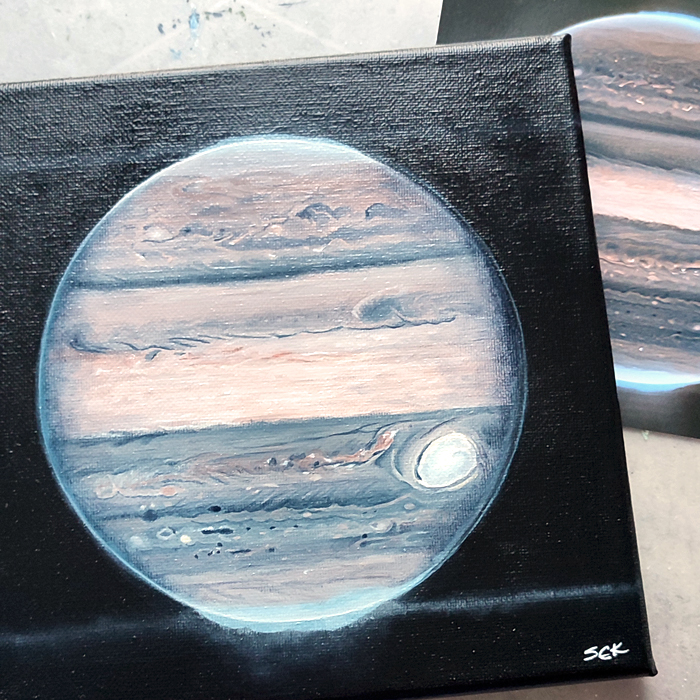
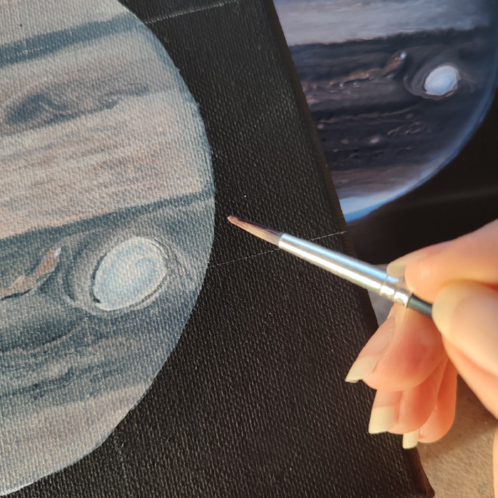
Jupiter’s Portrait
28. November 2023
Can you guess what it is?
23. November 2023
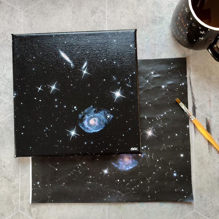
Holm 124 on canvas
16. November 2023
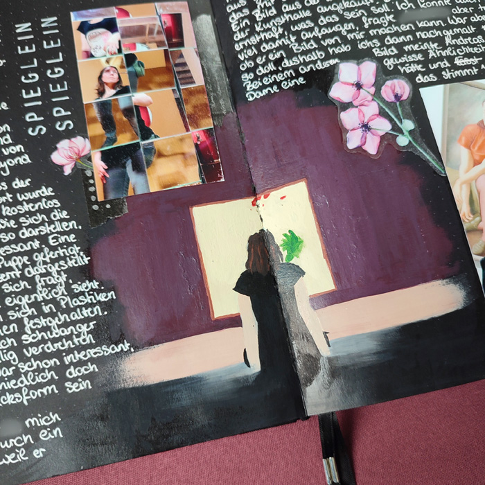
Mirrors, Reflections and a Creative Mishap
19. Oktober 2023
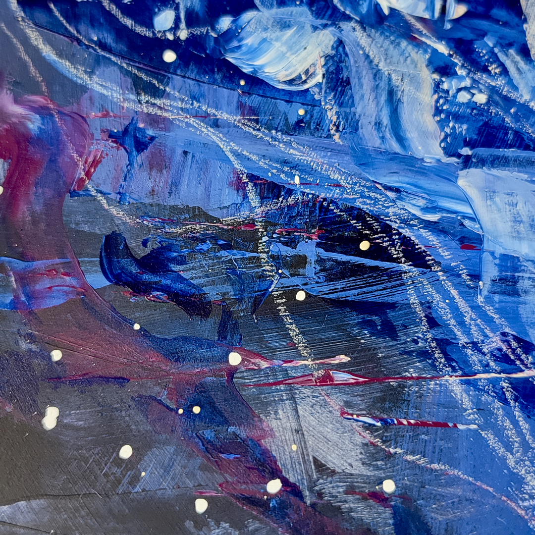
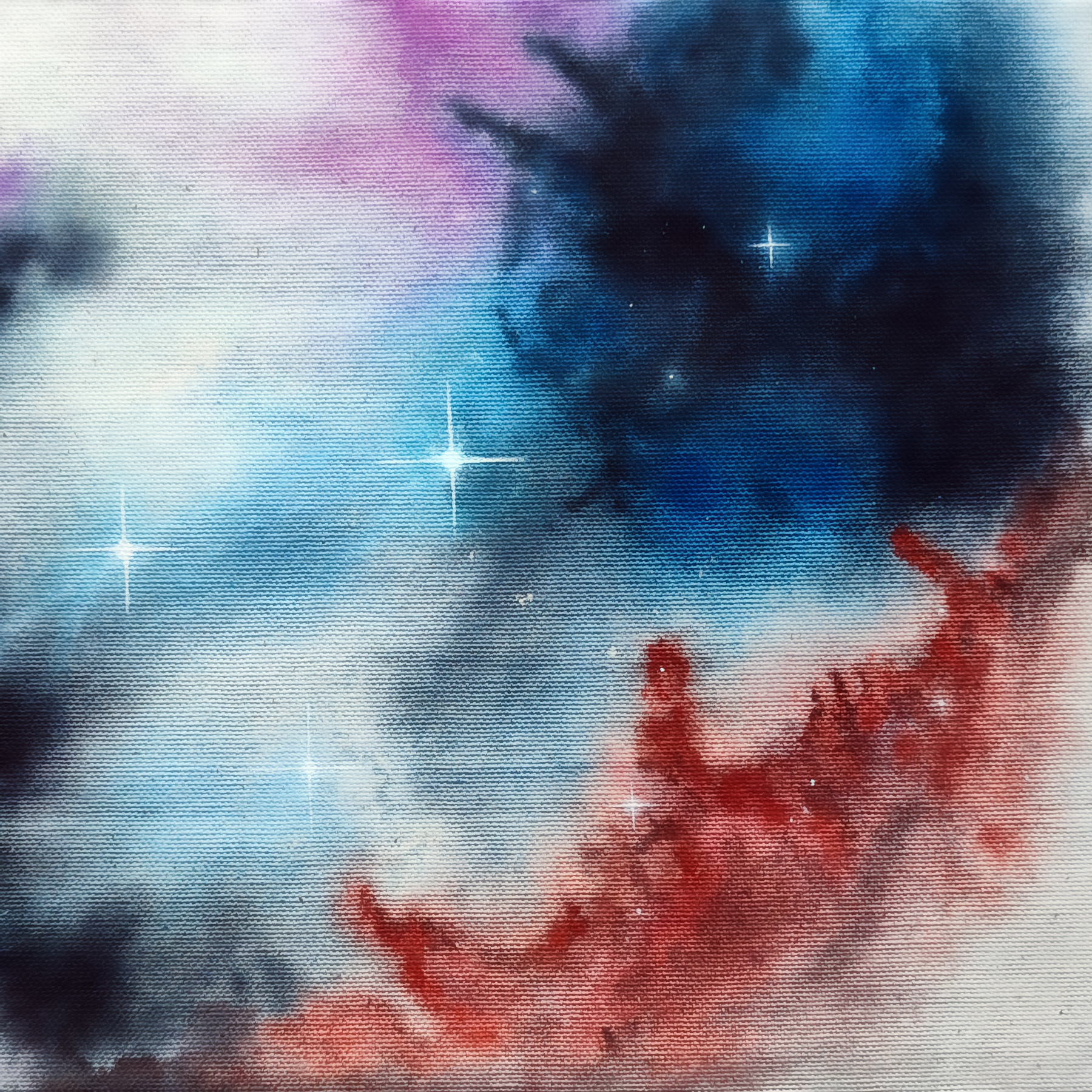
An exploration into space abstracts
6. Mai 2023
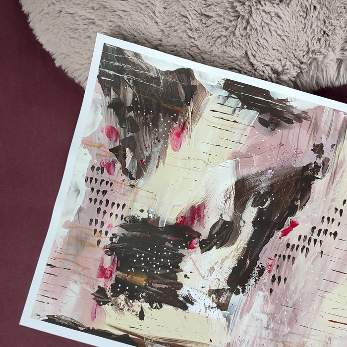
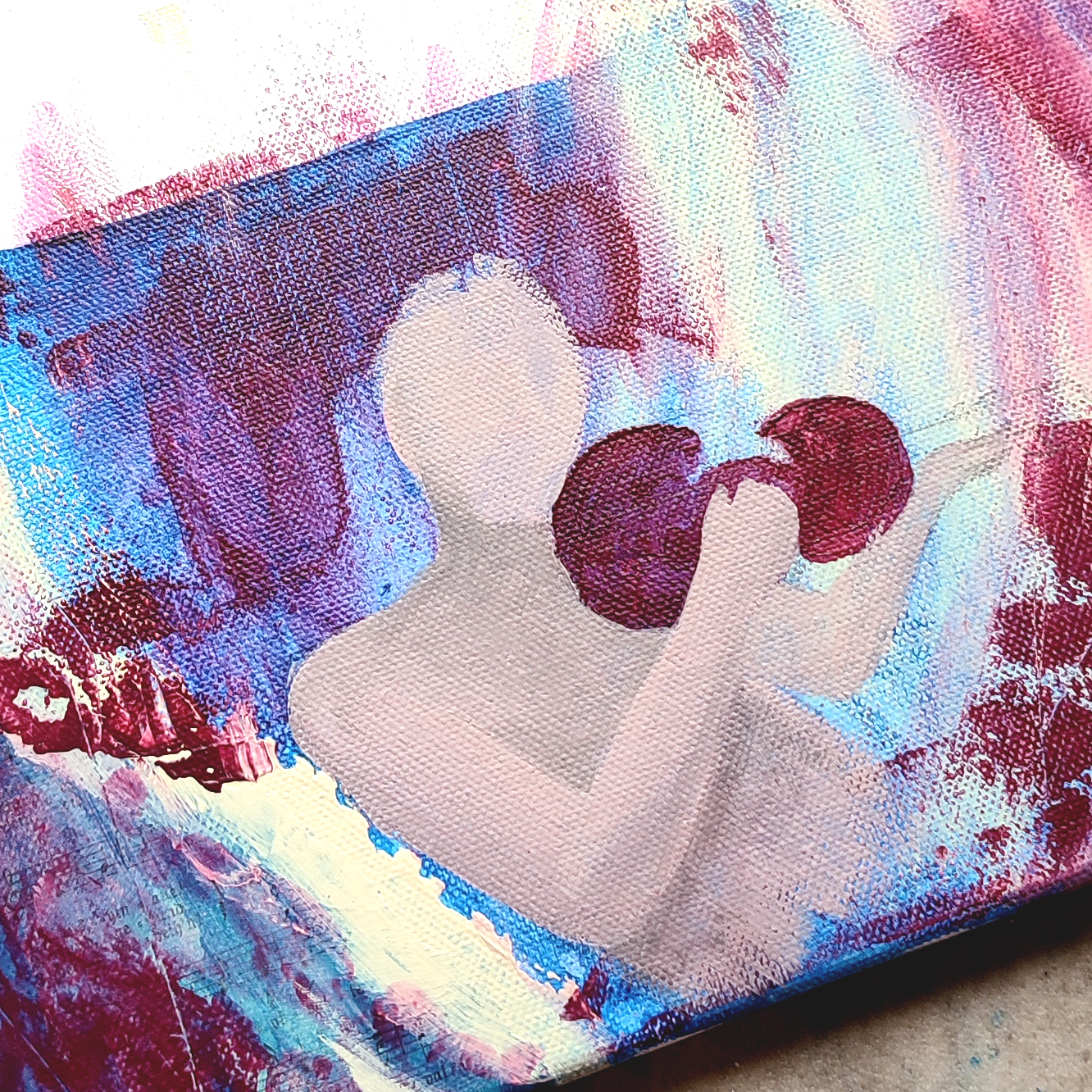
Adventures into abstract painting
3. Mai 2023
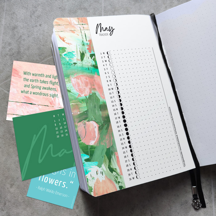
Free May Moon tracker
1. Mai 2023
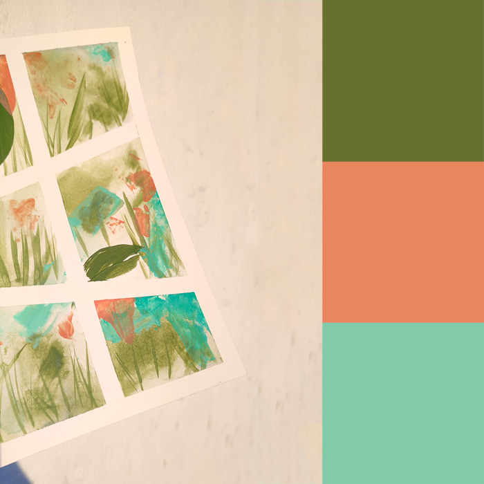
Explorations into abstract art
29. April 2023
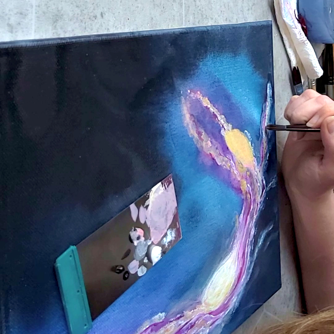
Bringing a Celestial Scene to Life
21. April 2023
A cosmic symphony
21. März 2023
Just found something…
24. September 2022
1
2
»