Zum Inhalt springen
About Sabse
Astronomy
Astrophotography
Observation Reports
Equipment
Art
Writing
Suchen
Schlagwort:
painting
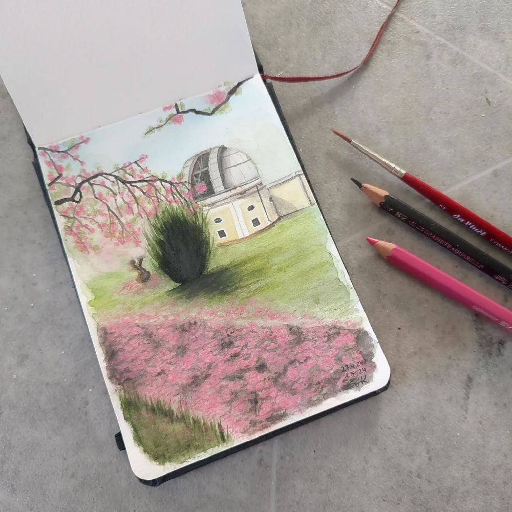
An enchanting Hamburg trip
1. Mai 2024
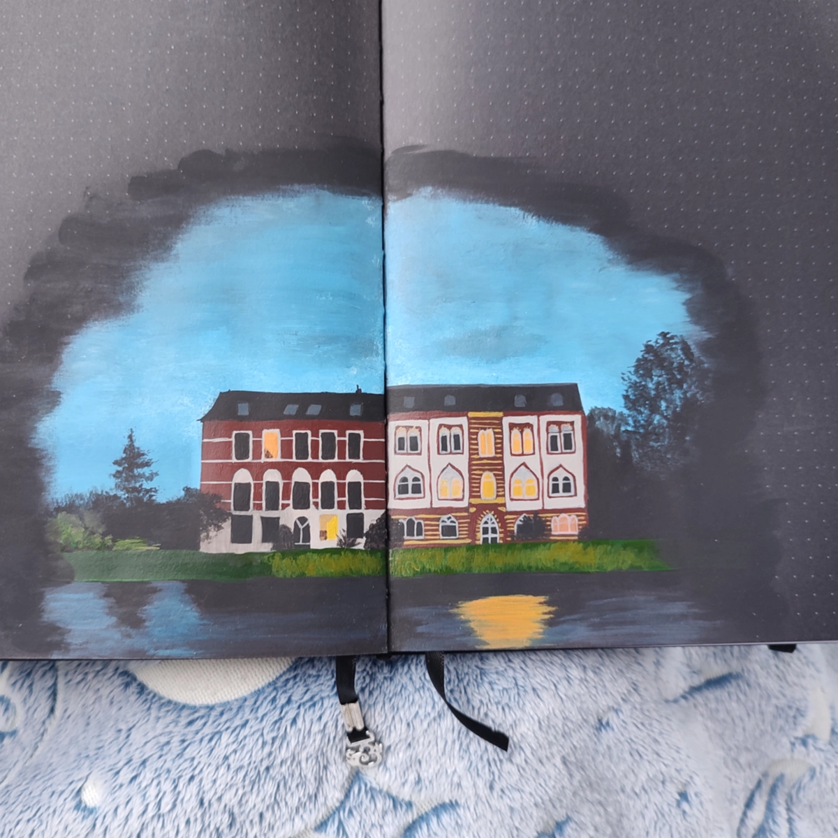
Three Houses
3. Dezember 2023
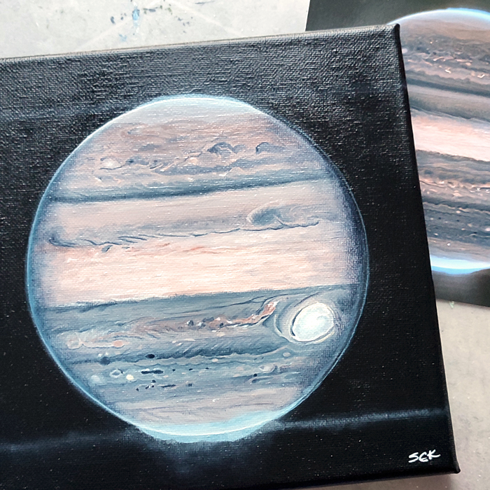
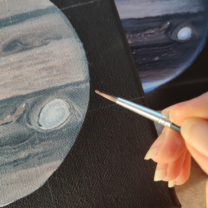
Jupiter’s Portrait
28. November 2023
Can you guess what it is?
23. November 2023
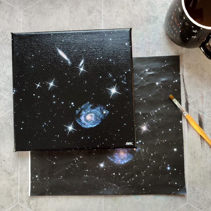
Holm 124 on canvas
16. November 2023
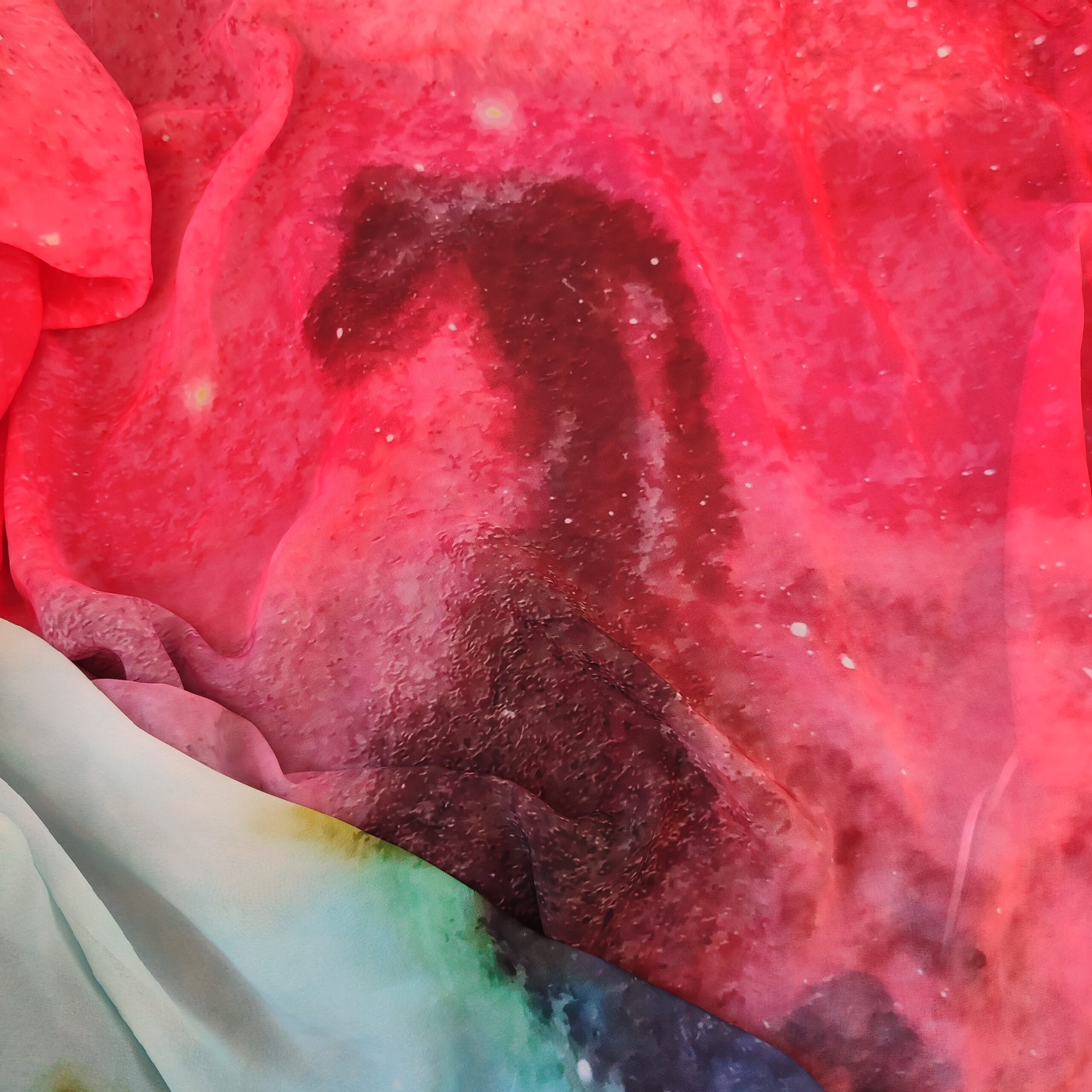
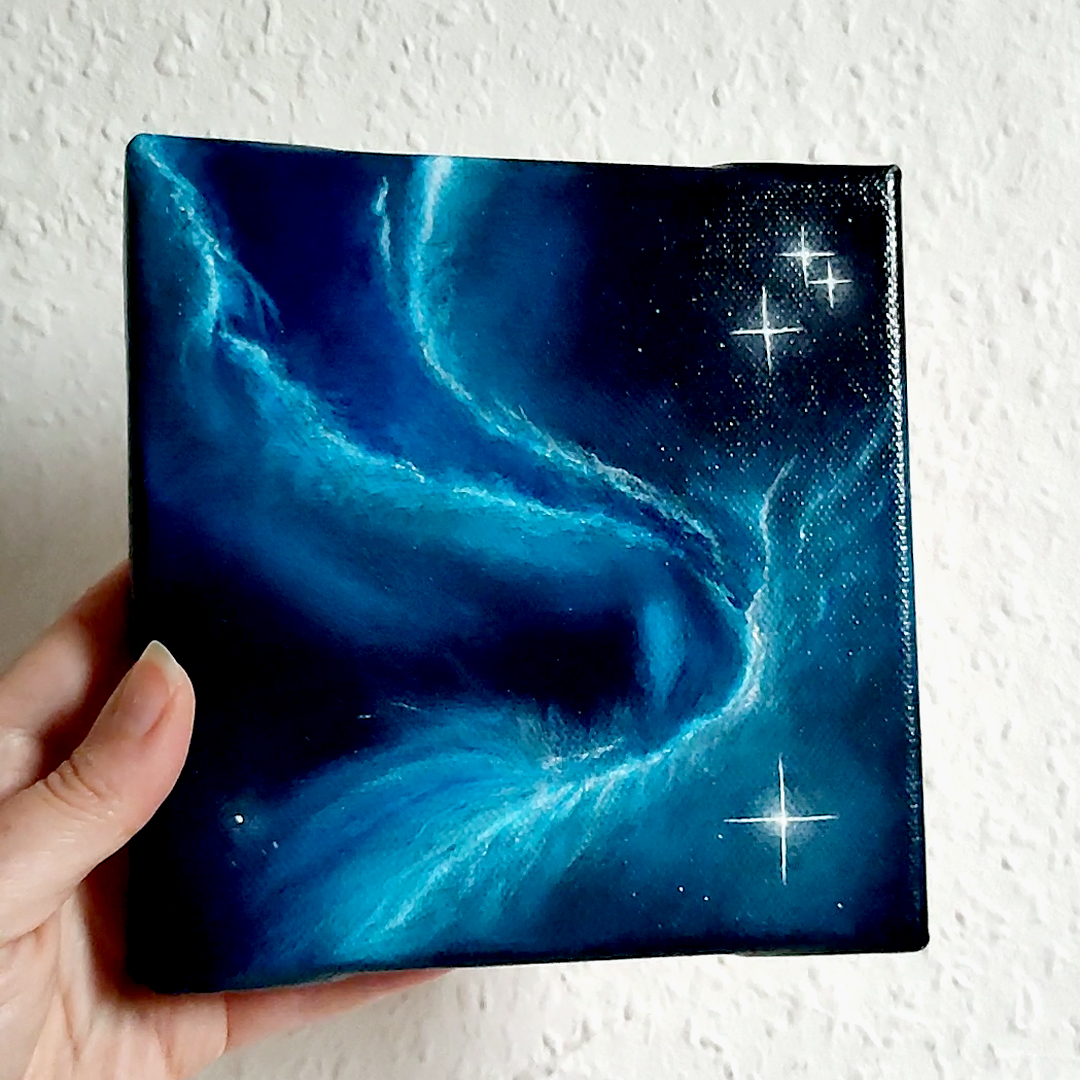
A spaced out scarf…
22. Oktober 2023
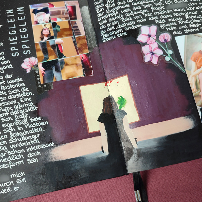
Mirrors, Reflections and a Creative Mishap
19. Oktober 2023
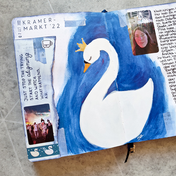
Swans and sweet memories
1. Oktober 2023
Varnishing my first ever oil painting
23. Juli 2023
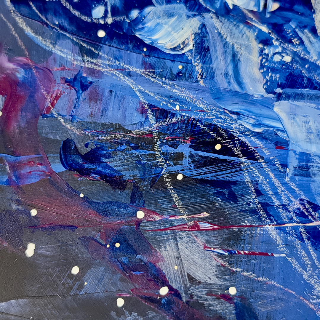
An exploration into space abstracts
6. Mai 2023
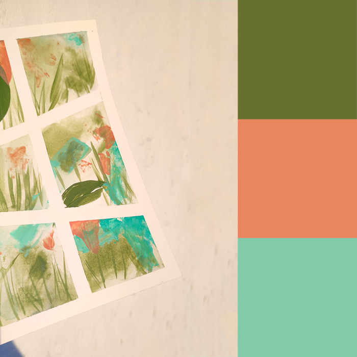
Adventures into abstract painting
3. Mai 2023
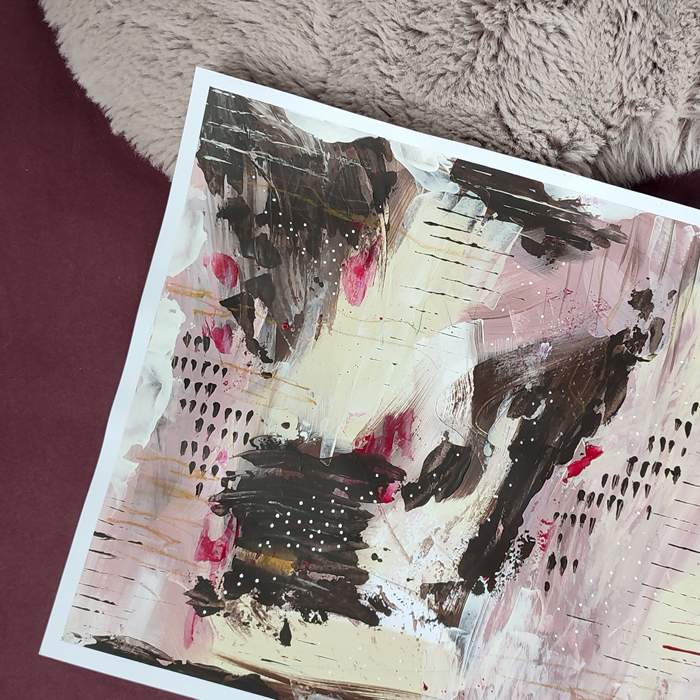
Explorations into abstract art
29. April 2023
1
2
3
»